In e-commerce, the product page is the moment of truth: it's where browsing turns into buying or doesn't. Sometimes, it's not the product or the price that gets in the way but it’s hesitation.
At dualoop, we help product teams remove that hesitation and help users feel more confident in their next move.
That’s what we did in this UX/UI audit of Orac, a leading brand in decorative mouldings. We focused on one product page and asked a simple question: what’s standing between the user and the 'Add to Cart' button?
The friction points we found
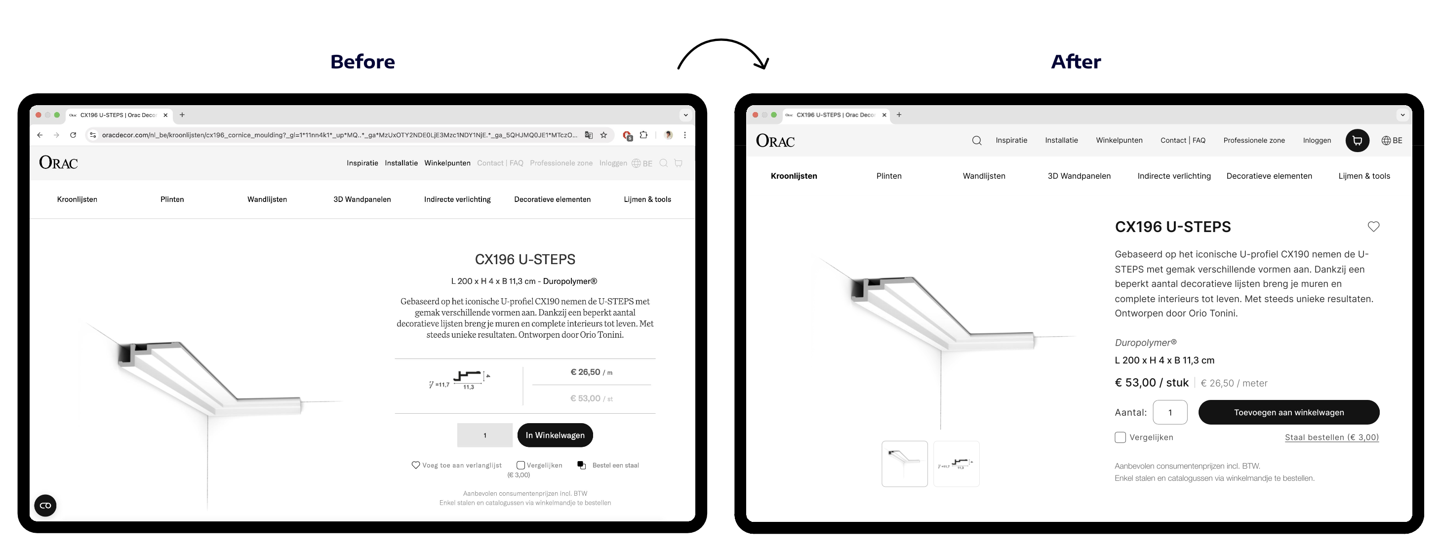
The product detail page had all the essential information, but the way it was presented created avoidable friction. Instead of guiding the user, it forced them to interpret, guess, and work harder than necessary.
🔵 Accessibility & readability
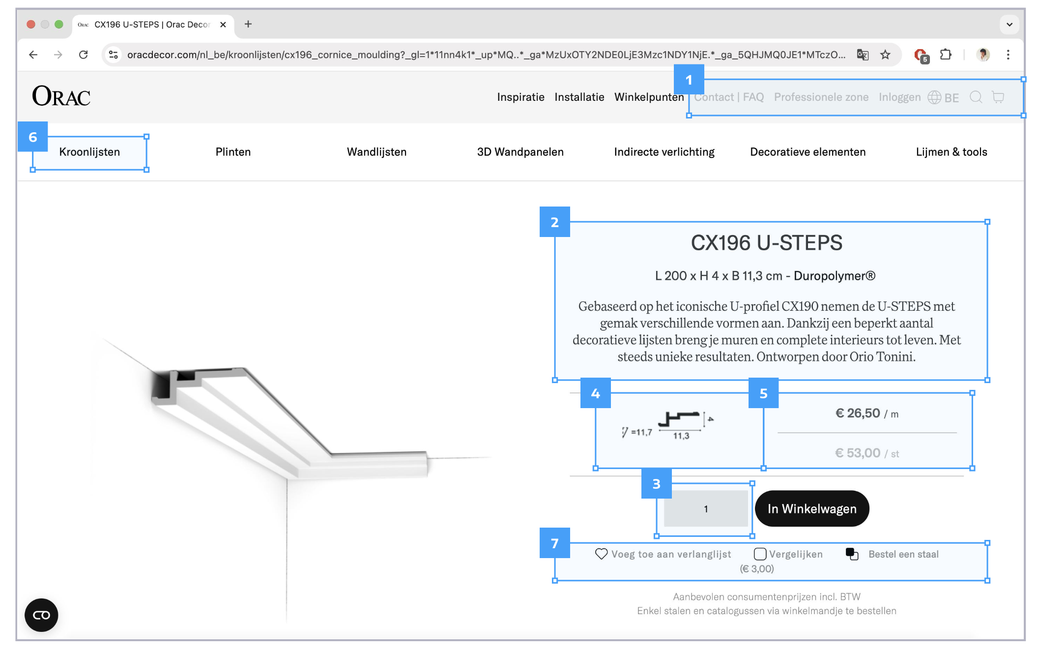
1. Low contrast
Important navigation menu links (element 1) lack contrast against the background, especially for users on less-than-perfect screens.
2. Alignment issues
The product description (element 2) is centre-aligned, which makes scanning harder for long text.
👀 Accessibility guidelines are clear: strong contrast and left-aligned text improve readability—for everyone.
3. Unclear input field
The amount input (element 3) required user input but lacked a descriptive label. This doesn't meet accessibility standards and makes a key action less intuitive.
🟣 Visibility & layout clarity
4. Technical details are too small
The product specs (element 4) are shown in a small, low-contrast image. The information is there, but only users with great eyesight will find it.
5. Mixed pricing info
Price per metre (€26,50) and price per unit (€53,00) are shown next to each other (element 5), but it’s unclear which applies or if users can choose.
6. No visual context for category
The selected category (element 6) isn’t visually distinct from others. That removes important orientation for the user as they don’t know what section they’re in.
7. Cluttered action zone
Three different buttons (element 7) are squeezed together below the primary action “Add to cart” and it’s not clear which one the “€3,00” label refers to. That’s extra work for the user, when it should be obvious.
👀 When users hesitate, conversion drops. Design should guide them, not confuse them.
The design principles we applied
We tried to focus on small UX improvements with high-impact. Here’s how we approached the redesign:
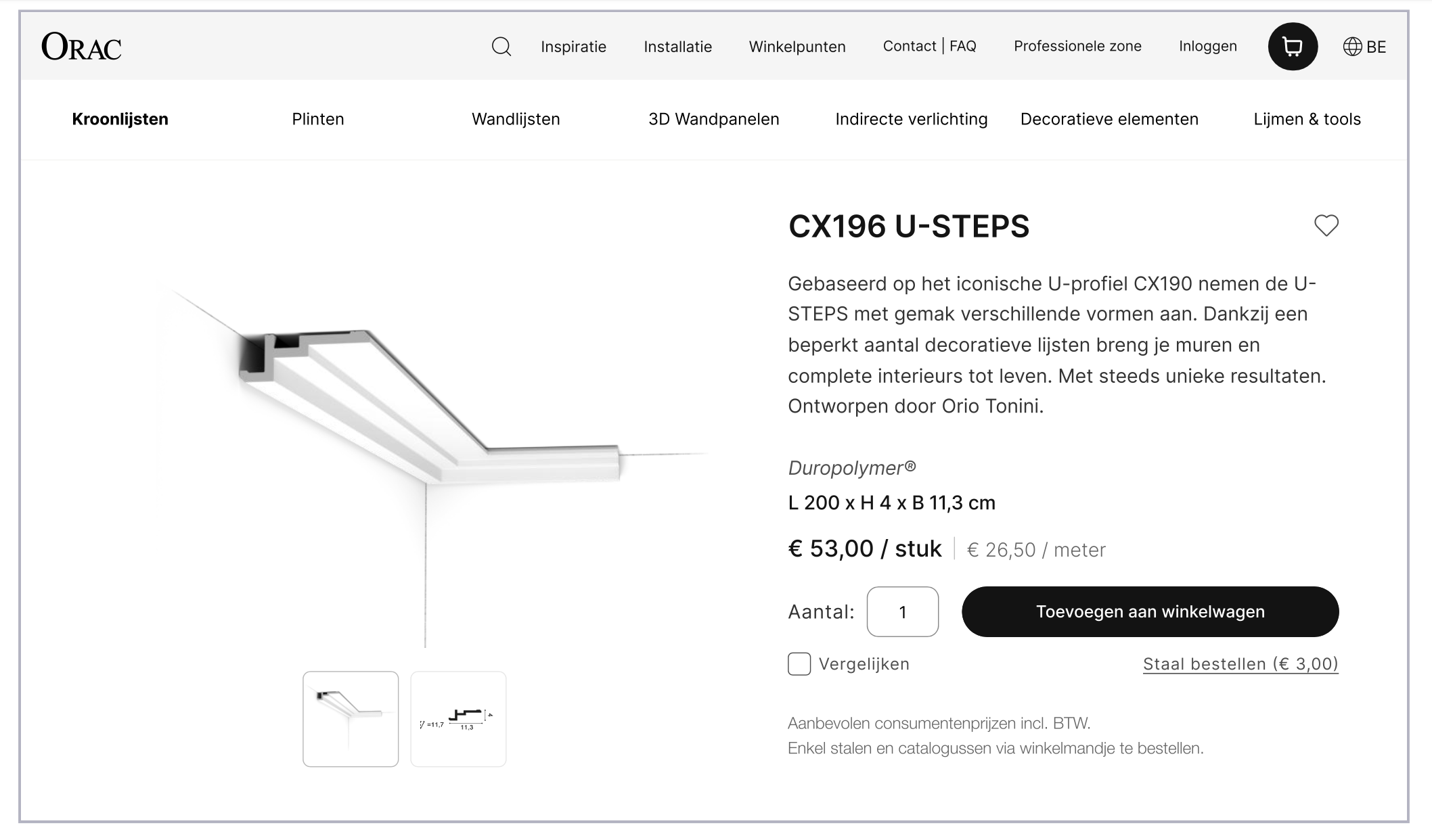
✅ Increased contrast and alignment
We updated the text style to improve legibility:
- Left-aligned all body text
- Increased contrast against the background
- Slightly increased text size for easier scanning
✅ Cleaner layout and visual hierarchy
- Clear spacing around price and actions
- Defined button hierarchy so the primary CTA (Add to Cart) stands out
- Repositioned price per unit and per metre for clarity
✅ Improved navigation visibility
We made the active category visually distinct by displaying it in bold so users know exactly where they are in the catalog.
✅ More accessible technical details
We made the technical details easier to view by displaying them in an enlargeable image.
✅ More clear action labels and inputs
The amount input now has a visible label. We also placed the “€3,00” ordering option next to its label to avoid ambiguity.
Why this matters: reducing hesitation, increasing conversion
Great product pages give the user everything they need to make a confident decision. In Orac's case, the original layout had the right content, but the design created small frictions that added up. By applying basic usability and accessibility principles, we made information more visible to users, making it easier for them to make a decision.
Whether you're selling decorative mouldings or SaaS subscriptions, your product page is where trust for your brand is won or lost. And very often, fixing it doesn’t mean redesigning the full website but just implementing small improvements (text alignment, spacing…) that can make a big difference for users.
We love partnering with product teams to uncover these hidden UX improvements! Want to see what we’d uncover in your product? Let’s talk.
